

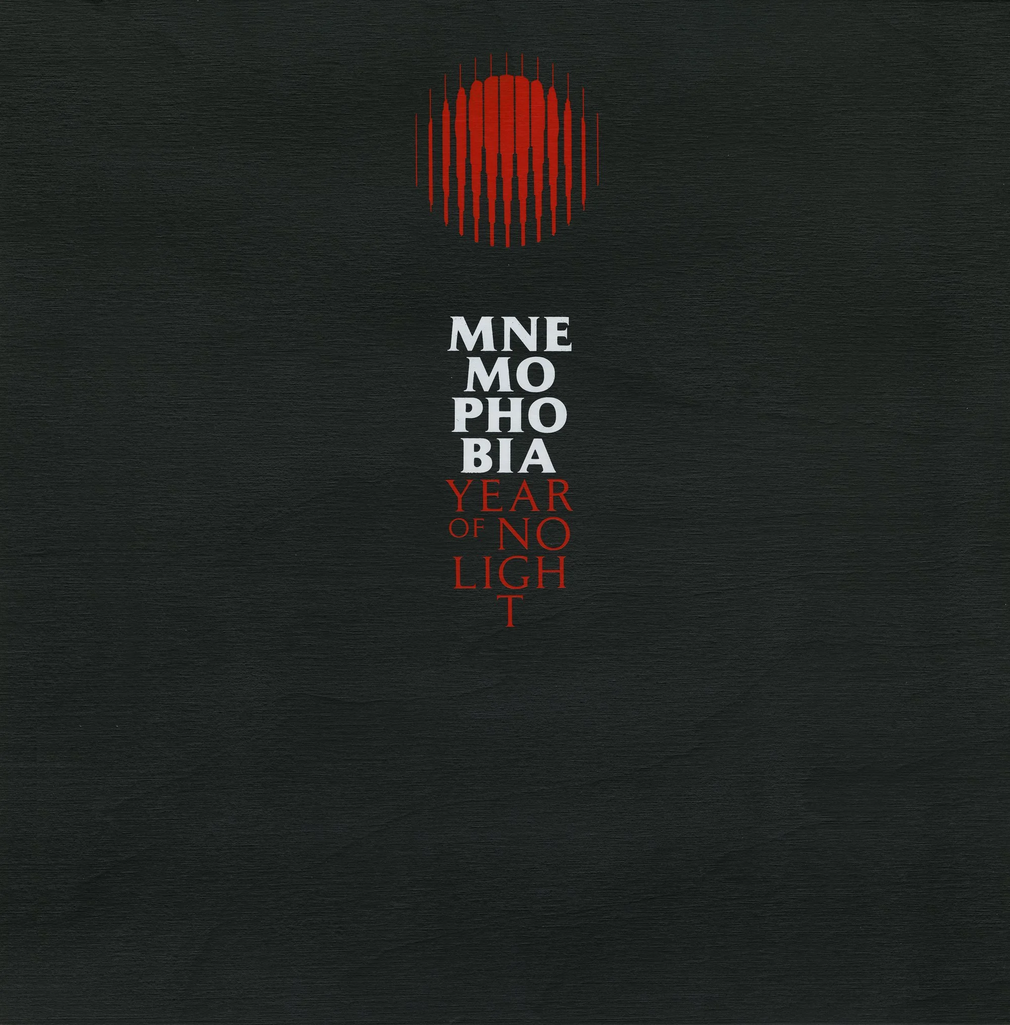
MNEMOPHOBIA
BOX SET
YEAR OF NO LIGHT
For their 20th anniversary in 2021, French post-metal band Year of No Light released, via Pelagic Records, a limited wooden box set bringing together their entire discography—from the new album Consolamentum to their four previous studio albums—along with an exclusive compilation of earlier EPs and collaborations. As the band had not released new material for eight years, they felt it was the right moment to introduce a renewed visual identity.
They commissioned me to rethink the band’s image through the design of the new album, the box set, and a new emblem.
Following discussions with the band members, the art direction drew on influences from brutalist architecture and 1970s op art, combined with a refined yet striking minimalist approach to typography and a single-color palette: red. Their supportive and enthusiastic label was also fully committed to producing a distinctive and ambitious package.

The band’s emblem symbolizes the interplay of light and sound waves. Having evolved twice over the course of the band’s history, this new iteration was designed by revisiting the optical art of the 1970s, with strong inspiration drawn from Victor Vasarely’s work.
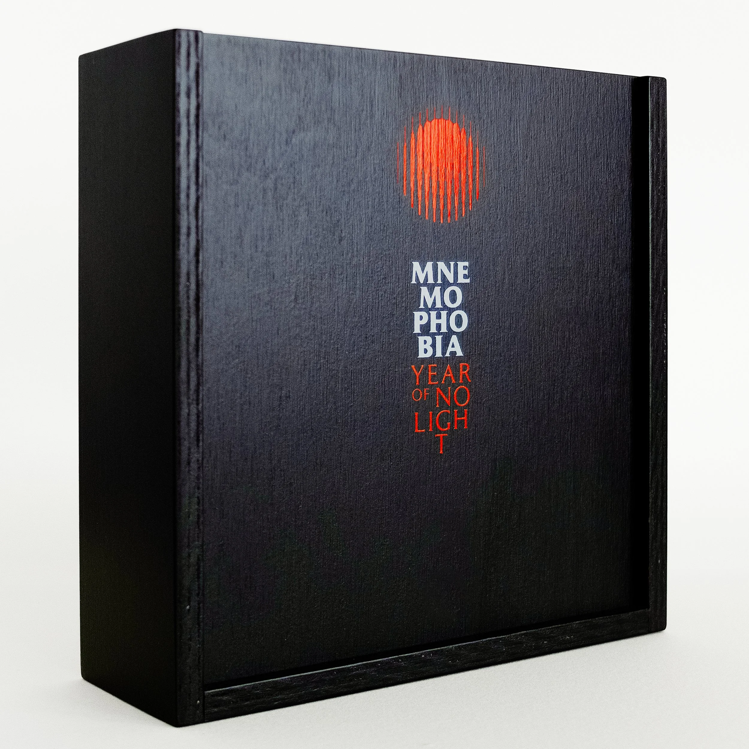
Box Set Cover
2-Color Screen Print on Black Wooden Box
Driven by a shared desire for consistency and a strong graphic identity, the band and label agreed to unify the artwork of the previous albums through a cohesive color scheme. All prior packaging designs were reworked according to the palette defined for this box set—red, black, and shades ranging from beige-ivory to yellow-orange. An obi strip was also introduced, both to enhance visual coherence and to clearly distinguish each album within the set.


All 6 2-LP Gatefold Sleeve Covers with Box Set Obi
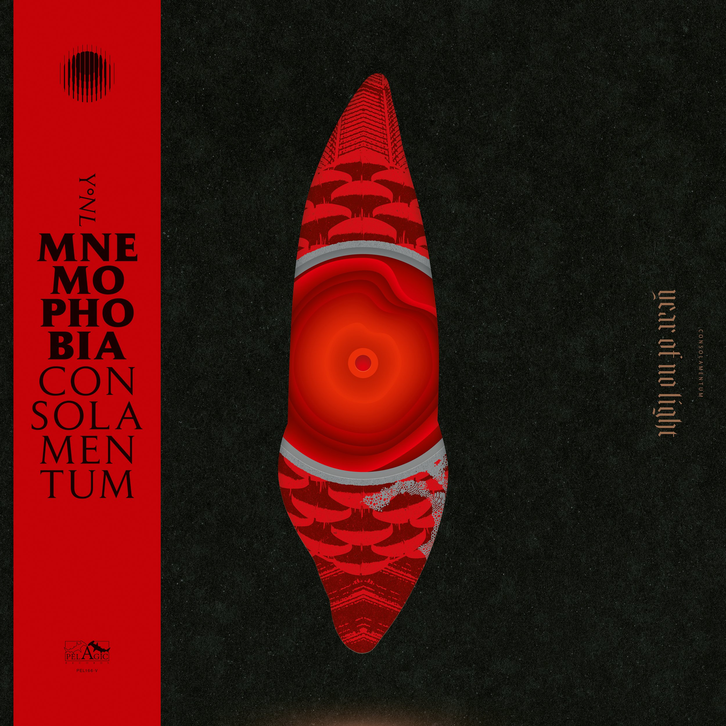
CONSOLAMENTUM
My goal was to create something that stood apart from the band’s previous album covers and to avoid the typical visual codes associated with the genres they are usually linked to. Architecture—particularly Brutalism—was suggested by the band and represented an unexplored and highly exciting territory for me. I also wanted to convey the abstract nature of their instrumental music while giving it a bold, graphic, and contemporary feel, bordering on pop art.
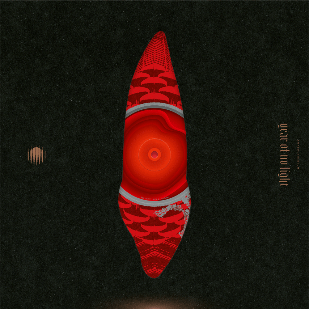
The opportunity to incorporate a special die-cut on the front cover inspired me to play with all printed components of the vinyl edition. The center labels, inner sleeves with center holes, and the front of the gatefold sleeve all became essential elements in composing the complete cover artwork. Even more excitingly, a 2-LP release meant four center labels and four inner sleeve sides with center holes, offering a total of sixteen possible variations of the cover art.
The design of the cover needed to be intriguing and minimalist, with the die-cut as the focal point to create contrast with the inner elements. The die-cut itself—evoking an unearthly, powerful monolith—was inspired by the shape of a canine tooth, reflecting an inherent ambivalence: the elegance of its smooth, streamlined form, alongside its potential as a dangerous tool.
Cover Art’s 16 Variants
The inside spread of the gatefold sleeve was equally important. We wanted it to stand apart from the rest of the artwork—something more illustrative, dramatic, and visually striking.
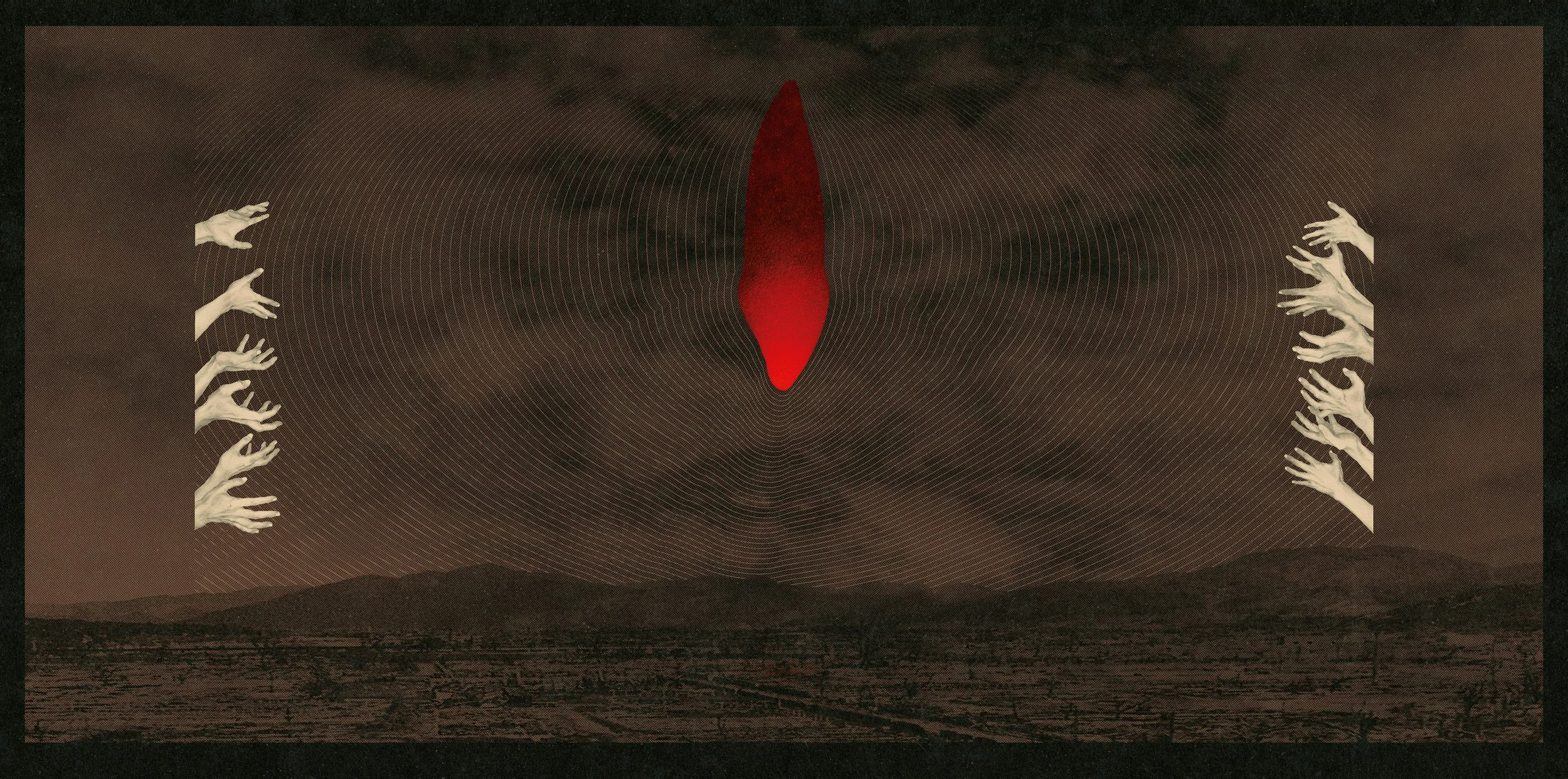
Gatefold Sleeve Inside Spread
For the inner sleeves, I drew inspiration from the forms of brutalist architecture, deconstructing, colorizing, and blending them into abstract graphic compositions. To complement these designs while maintaining their own visual identity, the center labels were created with flowing curves and subtle color gradations, giving them a psychedelic quality and the appearance of glowing membranes.
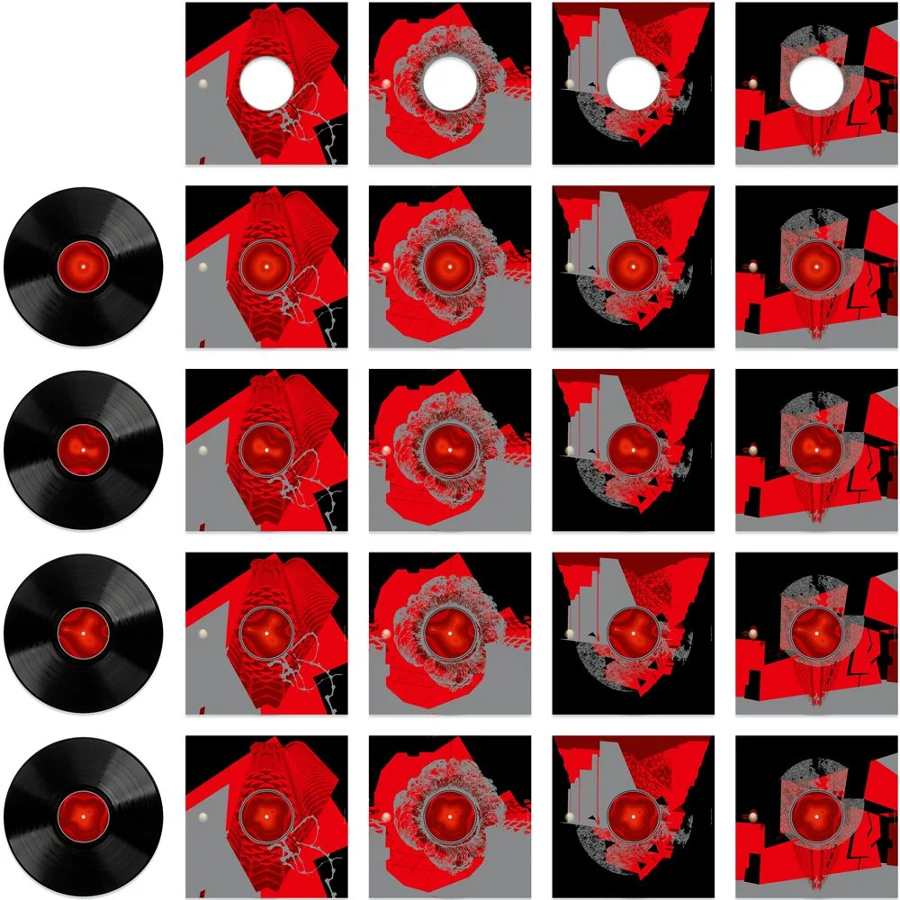
4 Sides of Both Vinyls and Inner Sleeves Combine to Offer 16 Variants
In addition to the highly symbolic cover art and the redesigned band emblem, and to align with the brutalist, monumental style the band envisioned, I chose a Gothic typeface and customized it for the band name and track titles. The goal was to infuse a sense of modernity, giving the letters a subtle, levitating effect.
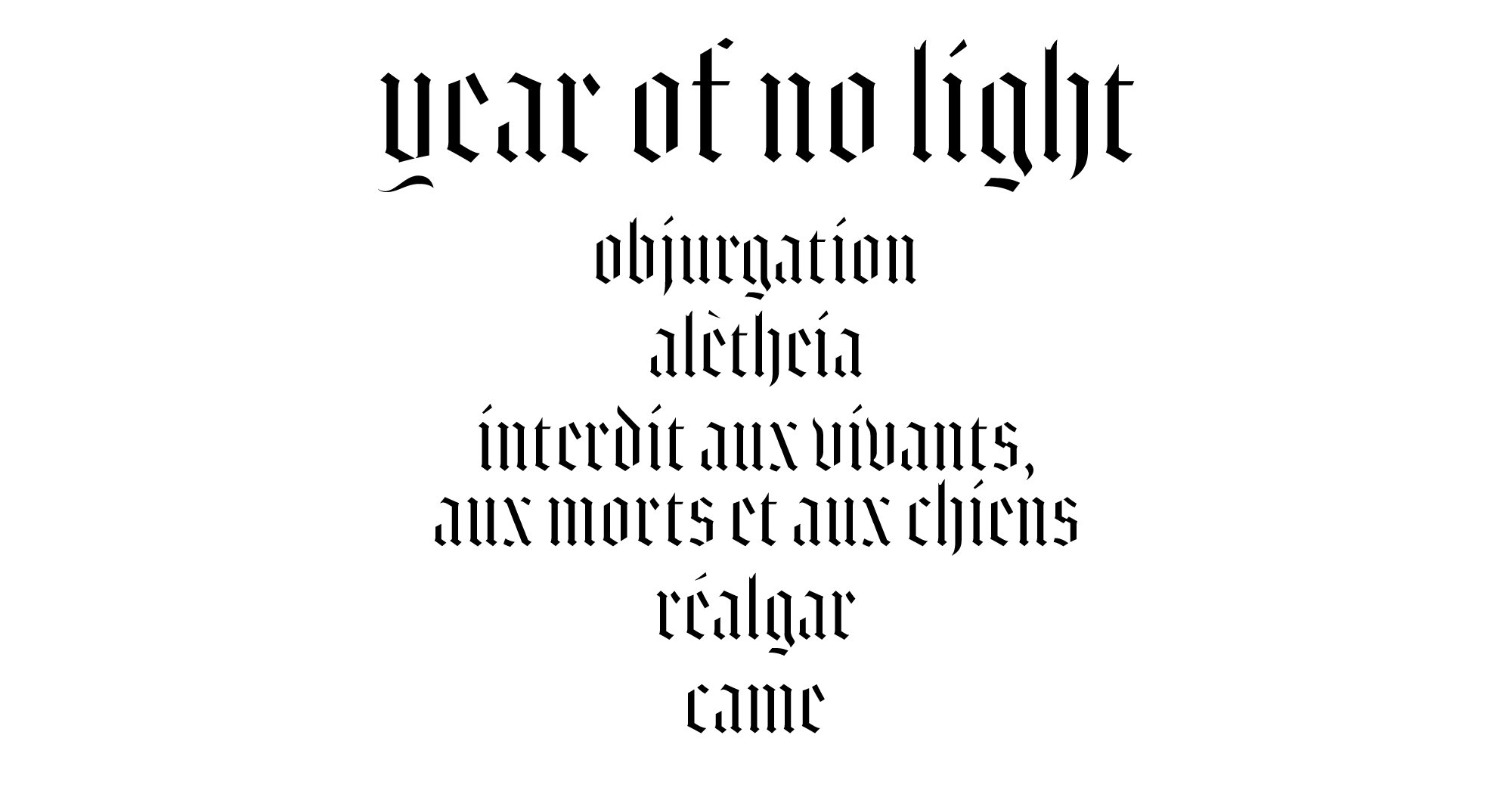
Customized Gothic Typography for Band Name and Track List

Back Liner
MNÈME

Cover
The compilation album Mnème is exclusive to this box set and gathers everything the band recorded and released between 2009 and 2015 outside of their studio albums.
The original concept was to use what is now the inside spread as the cover itself—the left panel would have served as the front. The idea was to rely on minimalistic typography rather than imagery, preserving the visual impact for the interior. However, the record label opposed this approach and requested a slightly more conventional design.

Gatefold Sleeve Inside Spread

Back Liner
POSTER
As with any contemporary box set, additional exclusive elements were created: a slipmat, a woven patch, and a metal pin featuring the new emblem, as well as a 12 × 24” two-color screen-printed poster on black art paper.

CD EDITION
The box set has also been released on CD, with the same attention to quality and detail, designed and manufactured to closely match the vinyl edition. While the CD version does not include a slipmat, the screen-printed poster has been replaced by a folded square poster produced using offset printing.